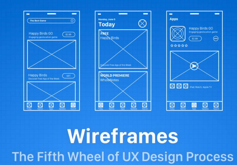
When developing a website or an application, it is common to think about how it will be, what features, menus… This initial idea, often scribbled on paper, has a name: wireframe .
What is a wireframe?
The wireframe is a stage in the development of a project, where we create a “skeleton”, which serves to illustrate, in a simplified way, a website or application.
The main objective of the wireframe is to focus on the organization of the content, among other characteristics of the Information Architecture. We already have an article that addresses the role of Information Architecture , but in a very summarized way, it focuses on helping the user to find what he is looking for.
A wireframe is considered a low-fidelity prototype, as it is far from the deliverable, not being so faithful, and can be modified and redone. It serves more to give us an idea of what the final product will be. Here we are going to focus more on a prototype of a website/app/system, but it can be used for anything, not just an app or website.
Below are some of the benefits of using wireframes:
- It presents more tangible and understandable results, also serving for an understanding of what will be done;
- Facilitates the alignment of customer expectations regarding what the user wants and the created project;
- Understanding how many canvases the project will need and how they should be designed;
- It helps in the layout of the content, facilitating the work of the designer;
- Promotes the development of layout variations;
Its revision and adaptation are cheaper to do.
As his focus is on being simple, he can often appear to be incomplete, but his magic is precisely in his simplicity. This sketch makes it a lot easier so you don’t waste a lot of time creating something elaborate. From this most basic sketch we can get more ideas for changes and improvements.
It is important to note that the wireframe serves to show terms of structure and not appearance. Therefore, at this stage we must think and observe other things, such as how the information will be organized, which menus it will have, how the flow of a page will be, how the main navigation will be, etc…
This must be done before we start thinking about colors, shapes, format, images, fonts, etc. This is also true because your client/user may not pay attention to what he really has to see. He has to see what really matters at the moment: if it’s intuitive, if the navigation is correct, etc.
In the wireframe you just need to have a rough idea of the information that is happening on the page, what the project will be about.
types of wireframes
We can divide the types of wireframes into three main ones:
Low-fidelity wireframe: as we have seen in this article, it is the simplest possible version, having the main elements, made in pen and paper, for example;
Annotated wireframe: in this type we already have an upgrade, being able to add more details to the wireframe, such as, for example, placing captions and annotations to facilitate the understanding of what each item does;
User Flow Wireframe: This type shows how a user will navigate through the content. Here everything can be static, without interaction. The focus is to show how a user flow works;
Interactive wireframe: here you can use software to create an interaction, whether with clicks, taps, zoom, etc.
Where to wireframe?
For each context that we saw above, the wireframe has a lot of details: it can be simple, done on paper, on a blackboard… Then you can go to a tool, making it more interactive, done in software like Axure and Sketch .
Always remember to avoid adding complex visual elements. At this stage, less is more. These elements can distract you from the main task.
You can use some techniques in wireframe development, like the “Crazy 8’s” technique, where you fold a piece of paper into 8 different sections and then make 8 different ideas of a wireframe as quickly as possible.

